

When I joined Dyte as a UI/UX Design Intern in 2021, the company was growing rapidly, but its design process was still evolving. As the second Product Designer, I had the rare opportunity to build Dyte’s UI Kit from the ground up—a scalable design system that would streamline development, ensure consistency, and accelerate the company’s product evolution.
During my 10-month internship, I focused on designing this system from scratch, ensuring that every component, interaction, and design token was structured to support Dyte’s real-time communication products. Later, when I was promoted to full-time Product Designer, I saw firsthand how this UI Kit became the backbone of Dyte’s design language, impacting multiple projects across the company.
This case study explores how I built Dyte’s UI Kit from scratch, the challenges I overcame, and the lasting impact it had on Dyte’s product ecosystem.

When I joined Dyte, the company’s design efforts were still in their early stages, and there was no structured design system in place. As Dyte’s product evolved, some key challenges emerged:

To solve these challenges, I set out to design a scalable UI Kit that would serve as the single source of truth for all future design and development work at Dyte.
Before jumping into component design, I focused on defining the core foundations that would ensure consistency, accessibility, and scalability.
Since Dyte’s platform needed to be highly customizable, I built a tokenized design system where colors, typography, spacing, and other foundational elements were modular and flexible. This allowed developers to easily adjust themes for different products without breaking design consistency. This foundation allowed Dyte to maintain consistency across all products while ensuring seamless scalability for future growth.

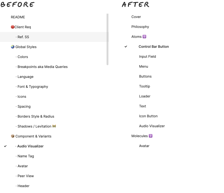
This is how the structure of the UI Kit evolved with time. We started with the arrangement on the life but as we started developing and shipping it out we realized that we had to organize it better so that its easier for our clients to use them and its easier for us to manage the components so we divide the components into atoms, molecules and organisms finally forming the templates and pages.
To maintain consistency and scalability, I established a design token system that covered color palettes, typography choices, spacing guidelines, and border styles. This approach enabled seamless customization, ensured a coherent visual language across components, and facilitated efficient collaboration between designers and developers.


Once the foundations were in place, I designed a comprehensive library of reusable UI components, ensuring each was:

🚀 Button System → Primary, secondary, ghost buttons with hover, active, and disabled states.
🚀 Form Fields → Input fields, dropdowns, checkboxes, and radio buttons with error handling.
🚀 Navigation Elements → Sidebars, tabs, breadcrumbs, and pagination for structured navigation.
🚀 Tables & Data Visualization → Interactive tables with sorting, filtering, and pagination.
🚀 Modals & Overlays → Standardized modal system with accessibility-friendly focus states.
🚀 Notification System → Alerts, snackbars, and toasts for real-time updates.


To validate the UI Kit’s effectiveness, I created interactive prototypes and conducted usability testing with internal teams. Key focus areas included:
🔹 Interaction Consistency → Ensuring buttons, inputs, and dropdowns behaved consistently across different screens.
🔹 Developer Handoff Efficiency → Working closely with engineers to streamline component implementation.
🔹 Accessibility Checks → Testing contrast ratios, focus states, and keyboard navigation to meet WCAG standards.


Refinements Post-Testing
✅ Improved focus states for accessibility compliance.
✅ Adjusted component padding for better visual balance.
✅ Refined hover and active states to enhance usability.
After the UI Kit was fully implemented, the impact was immediate and far-reaching:

1️⃣ A Design System is More Than Just UI Components: It’s a collaboration tool that bridges the gap between design, development, and product teams, enabling faster, more efficient workflows.
2️⃣ Early Prototyping Saves Time Later: By validating UI components early, I was able to identify usability issues before they reached development, saving significant time and effort.
3️⃣ Scalability Should Be Built-in From Day One: Designing with future growth in mind—such as tokenized themes, responsive components, and accessibility-first principles—ensured that the UI Kit remained useful beyond the immediate project scope.
4️⃣ Cross-Functional Collaboration is Key: Working closely with developers and stakeholders ensured that the design system was not just visually cohesive but also technically feasible and developer-friendly

Building the Dyte UI Kit was a transformational project, both for the company and for my own growth as a designer. It laid the foundation for faster, more efficient product development, influenced multiple future projects, and set Dyte on the path to a more scalable and consistent design ecosystem.
🚀 From joining as an intern to becoming a full-time Product Designer, this experience reinforced my passion for creating scalable, user-centric design systems that have lasting impact.


