

Imagine being tasked with designing an entire user interface from scratch—without an existing framework, reference point, or even clear stakeholder requirements. That was the challenge I faced when I joined Lightmatter as a Product Designer last summer.
As the company was developing its first-ever UI/UX, I had the opportunity to define user experiences, create foundational design principles, and build a scalable design system that would guide future product development. But before I could craft a seamless, user-friendly interface, I had to tackle an unexpected challenge—unclear stakeholder requirements.
Scroll down to see how I approached this problem. 🧐
When I joined Lightmatter, there was no UI in place for their products, nor any established visual design direction. The team was starting from square one. To get things moving, I began by conducting stakeholder interviews to understand their vision and gather insights about the products.

However, the stakeholders themselves lacked a clear understanding of how to articulate their design needs. This was understandable, as the company had never worked with a dedicated UI/UX designer before. With that in mind, I decided to take the lead in shaping the vision for the product's design.

.png)

Instead of waiting for the perfect brief, I took the initiative to start building the UI and design system from scratch, guided by the minimal insights available.
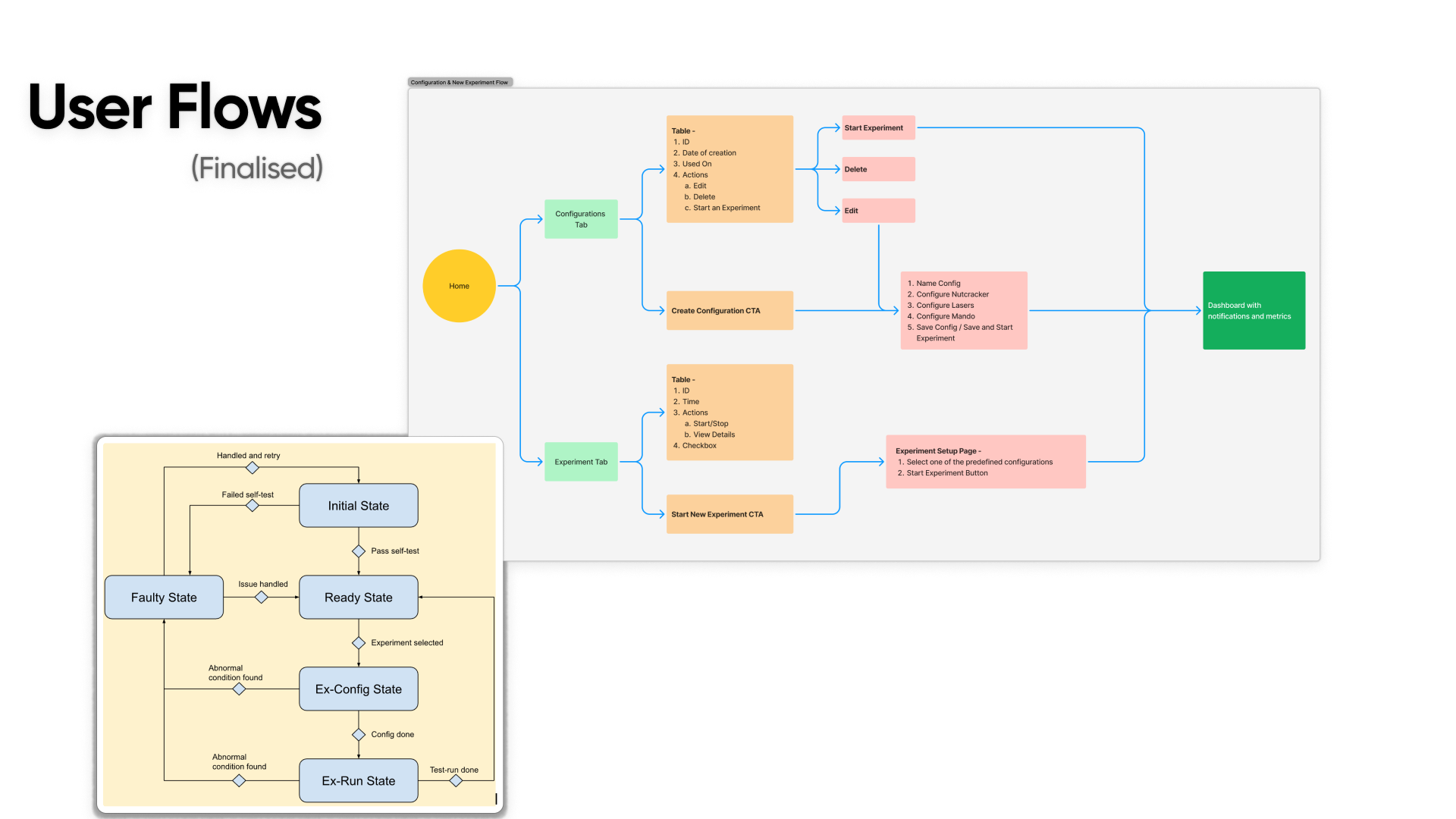
Instead of waiting for more defined requirements, I took a reverse approach—designing user flows and wireframes first to give stakeholders something tangible to react to. This process helped bridge the communication gap and played a pivotal role in shaping the product's final direction.

Since I didn’t have a complete set of requirements, I started by breaking down the problem into possible user interactions.
- I asked: What are the core actions users would take within the product?
- I mapped out how a user might navigate through different functionalities.
- I created rough user flows that visualized how the system could work, even without all the details.
At this stage, I wasn’t focusing on specific UI elements—instead, I was defining the logical structure of how users would interact with the system.

Once I had the user flows mapped out, I translated them into low-fidelity wireframes. These wireframes:
✔ Focused on structure, not visuals → I didn’t worry about branding or aesthetics—just core functionality.
✔ Showed the key interactions → Where users click, what they see next, how they complete tasks.
✔ Served as a conversation starter → They weren’t final designs but conceptual blueprints to get feedback.
At this stage, my goal was to create something visible and interactive, even if it was just a bare-bones wireframe with placeholder elements.

Once I had the wireframes and user flows, I re-engaged the stakeholders.
- Instead of asking broad, abstract questions like “What do you need?”, I now had specific screens and interactions they could respond to.
- The wireframes helped stakeholders visualize the product, making it easier for them to identify what worked, what was missing, and what needed changes.
- Through this process, they were able to articulate their expectations in a much more concrete way, providing insights that they couldn’t express during the initial interviews.
🔹 Example: A stakeholder might not have known how to describe a necessary feature, but when they saw a wireframe, they could say, “This needs a filtering option” or “We should add a progress indicator here.”


With better-defined feedback, I iterated on my designs:
✅ Refined the user personas → With more insights from stakeholders, I adjusted personas to better reflect actual user needs.
✅ Updated user flows → Improved task efficiency and added missing steps based on feedback.
✅ Created version 2 of the wireframes → Now with more accurate content, interactions, and clearer information architecture.
This iterative process turned my rough assumptions into a well-defined product vision that was now aligned with both business goals and user needs.


Once the wireframes and user flows were finalized, I transitioned to high-fidelity UI design.
Since this was Lightmatter’s first UI, I wanted to ensure that everything was built on a solid, scalable foundation. I developed a comprehensive Design System, focusing on:


These elements were documented meticulously so that future designers and developers could easily adopt and expand upon them.


Once the foundations were in place, I moved on to designing the UI components—the reusable building blocks of the interface.

Each component was:
✅ Flexible → Designed to adapt across multiple screen sizes.
✅ Accessible → Followed WCAG standards for usability.
✅ Consistent → Aligned with design tokens to maintain visual uniformity.


This diagram outlines our process for syncing design tokens from Figma to GitHub. Without access to Figma’s enterprise plan and its Variables API, we had to manually export tokens and maintain consistency across branches through version-controlled JSON files. This ensured alignment between design and development, even in a non-automated setup.Due to the lack of access to Figma's enterprise plan, we couldn't leverage the Variables API to automate theming across the design system. As a result, we built a structured yet manual workflow to ensure consistency while updating theme tokens across components—painful but effective in keeping system integrity intact.

We used Anima to convert Figma components into clean, production-ready React code. This workflow significantly accelerated handoff by bridging the gap between design intent and implementation, allowing developers to work with real, responsive components instead of static mocks.

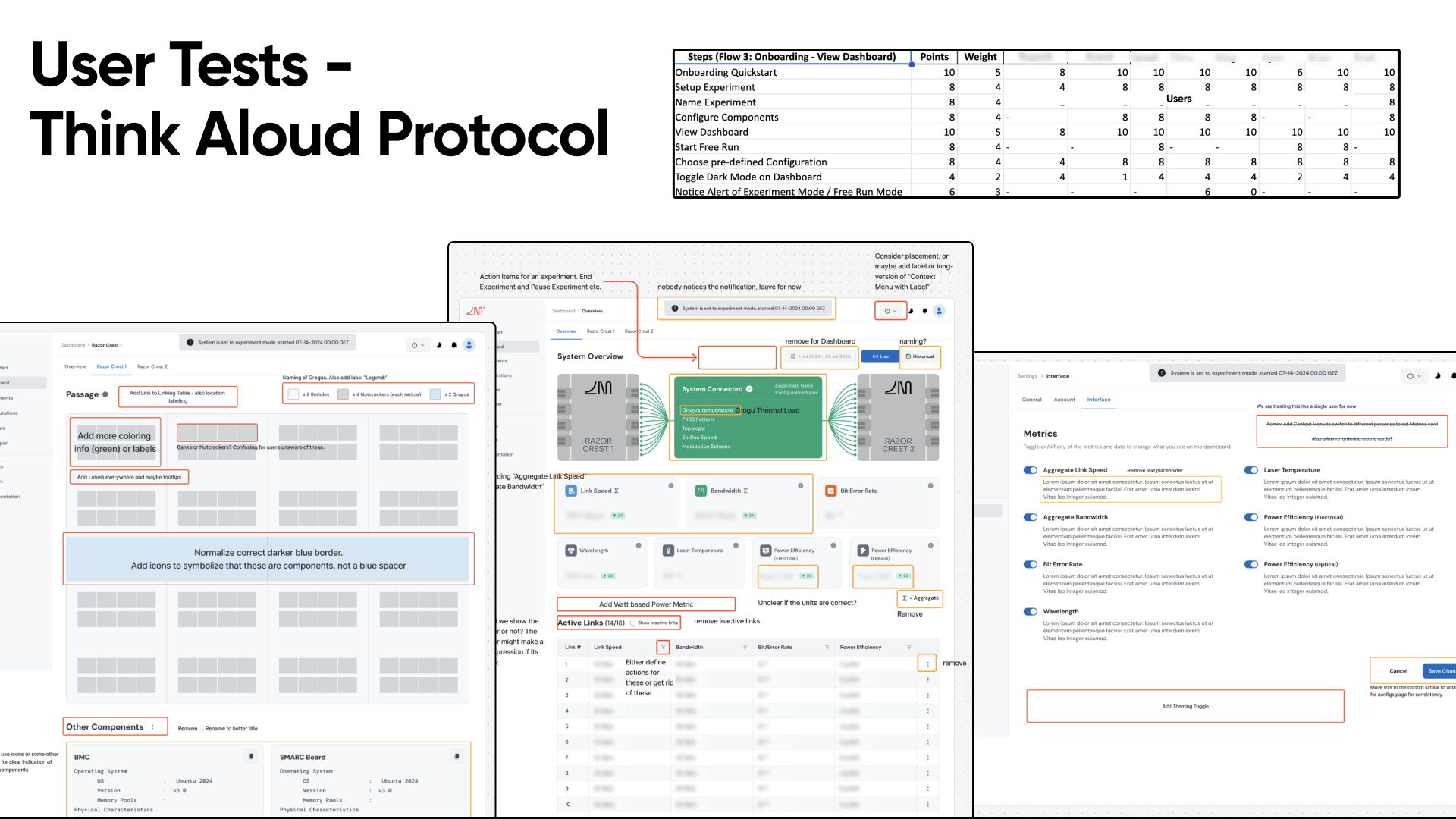
With the UI components finalized, the next crucial step was to bring them to life through interactive prototypes. This allowed us to simulate real user interactions, test usability, and identify areas for improvement before handing the designs off to developers.
I created high-fidelity prototypes using Figma, incorporating all the core UI elements, including buttons, input fields, navigation structures, dropdowns, and interactive states. These prototypes closely resembled the final product, providing a realistic environment for stakeholders, testers, and engineers to experience the design firsthand.


I conducted multiple rounds of usability testing with both internal stakeholders and potential users to assess the design’s effectiveness.

The key areas of focus during testing included:

I structured these tests using task-based scenarios, where participants were asked to complete common workflows. I observed interaction patterns, hesitation points, and feedback trends to identify usability issues.
.jpg)
The implementation of the Design System had a significant impact on both the product and team efficiency.
✨ Consistency Across the Product → Every UI element followed the same rules, improving brand identity and usability.
⚡ Faster Development Cycles → Developers had a clear component library to pull from, reducing back-and-forth design clarifications.
💡 Improved Collaboration → A shared Figma design library allowed designers and developers to work in sync.
🔄 Scalability for Future Growth → The system was structured for easy expansion, making future updates seamless.
Reflecting on my seven-month journey at Lightmatter, building the company’s first-ever UI and Design System from scratch was both a challenging and rewarding experience. Beyond delivering a structured, scalable system, this project reinforced valuable lessons that I will carry forward in my career.


